
 |
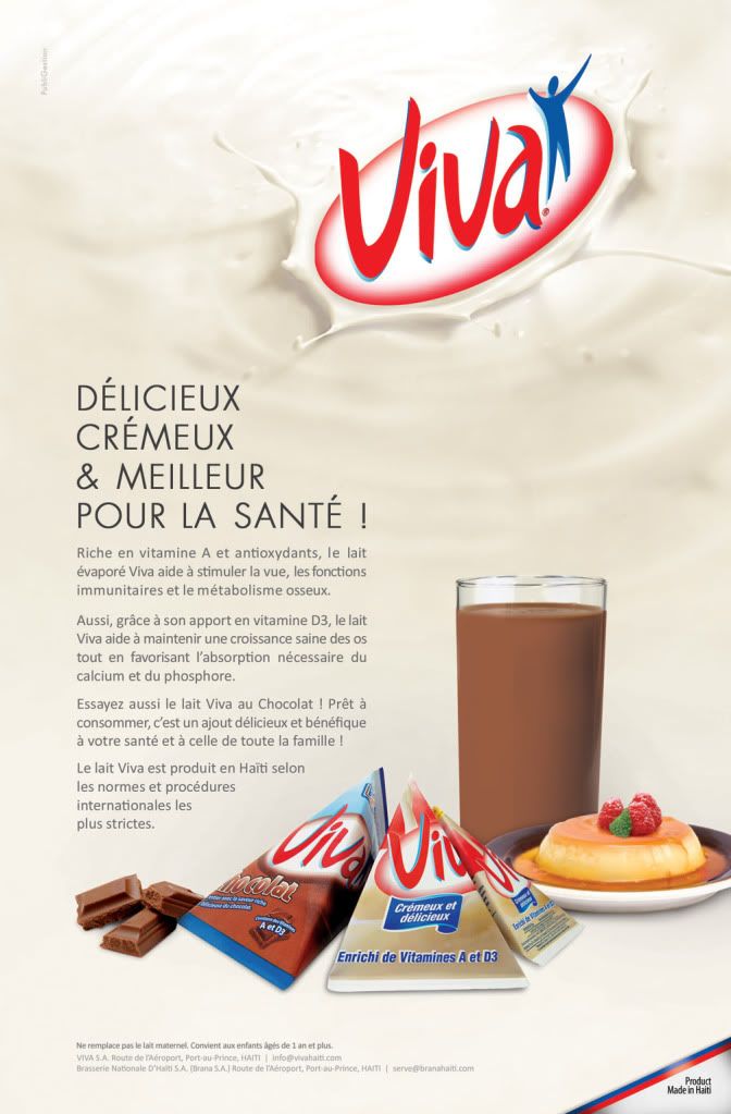
| An ad we did at PubliGestion for NB magazine. One of the first ads in Haiti to have this much whitespace. |
Designer lands in Haiti like little David in front of a design Frankenstein goliath of clashing colors, shouting fonts and busy background. But David meets him, mouse in hand, Mac Book Pro on the other. He triumphs! Yey!
It’s a real challenge to spar with the common design sense in Haiti, where less is not more and where whitespace is a waste. But if you ask me, it’s also the reason why a brand should be celebrated for coming up with an ad that is clean and with plenty of whitespace.
We never thought that such a clean predominantly white layout could ever see the light of production, but we were wrong. Client approved the design! So let’s celebrate the Viva ad for it’s clean layout and generous whitespace—a rarity in Haiti. Yey!
Copyright © Whitespacelover a.k.a. poNg li 2011 All Rights Reserved, unless stated otherwise. You may copy and/or use the content of this blog only if you acknowledge this blog and other party as the source of the material.
No comments:
Post a Comment